Scheduled to be released next week, visual analytics provider Curalate’s Instagram study discovered single-colored images were more popular than images with multiple colors, winning seventeen percent more Likes. After analyzing over thirty image features of eight million Instagram photos, Curalate found images with blue hues received twenty four percent more Likes than photos with predominantly red hues on the photo-sharing platform. The Instagram study results were much different than the findings from Curalate’s earlier Pinterest study that found, among other things, red images were more likely to be repinned than blue images on Pinterest boards.
“We noticed this too and thought it was pretty interesting,” said Curalate CEO Apu Gupta, “Becoming a more visual-centric marketer is still in its infancy. Instagram and Pinterest are relatively young platforms, and it’s clear the way people engage with these platforms is different.”
Curalate Instagram Study: The Dominant Color

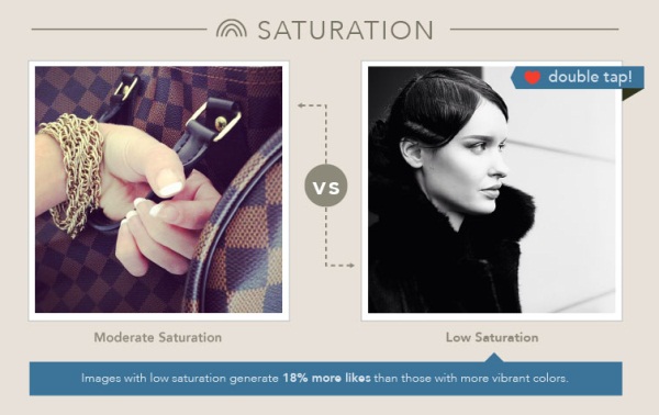
Beyond colour, Curalate discovered images with a high amount of lightness garnered twenty four percent more likes than dark images, and low saturation images received eighteen percent more Likes than photos with “vibrant colors.”
Curalate Instagram Study: Saturation

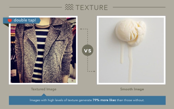
Other image features impacting whether or not an Instagram image received a Like included background and texture, with images that had a high amount of background winning twenty nine percent more likes than those without backgrounds. Images with texture won seventy nine percent more likes. Likes on Instagram, while incredibly valuable, are hard to come by with sixty five percent of Instagram images garnering between zero and ten likes.
Curalate Instagram Study: The Image Texture

According Curalate’s research:
To generate consumer interest, images should allow the eye to rest by having some background space. Images with a large amount of background space (above ninety percent) are very successful. Despite this, seventy percent of current Instagram images only have zero and twenty percent background space, leaving significant room for improvement.
As far as the further differences between what works on Instagram versus Pinterest, Curalate’s research found Pinterest images with less than ten percent background won two to four times more repins than images with a high amount of background, unlike Instagram where images with more background were more popular.
Also, Pinterest images with fifty percent saturation or more received ten times the number of repins than desaturated images, while Instagram images with low saturation earned more Likes.
This is probably reflective of the way people use these platforms. Instagram is about documenting and celebrating experiences. It’s no surprise that a lot of those experiences happen when you are out and about – think blue sky, blue ocean. Pinterest is much more about discovery and inspiration. A lot of what Pinterest users are interacting with are professional photos shot by brands (not users), and frequently those photos represent things (e.g. clothes) and those things are on people.
On the differences between the popularity of blue and red hued images on Instagram and Pinterest, Gupta noted that flesh tones register on the reddish scale. It’s also possible that Instagram’s filters are washing out some of the tones that would have been considered reddish which may have obscured the data.
